Sunday, February 5, 2012

Quick and Dirty Photoshop Tutorial - Modifying Old Black-and-White Photos

Let me say before I even start that I mean to step on no one's toes. The author of this textbook, the lovely and accomplished Keiko Fukuda, has  done more for women's judo than anyone else in the history of the sport. She recently celebrated her 98th birthday last year and is still active in promoting and teaching judo. She's the highest ranked female judoka in the world - ever. They're making a movie about her. So when I say that I mean absolutely no disrespect with this photoshop tutorial, know that I mean more than that. This woman is amazing, and I would not EVER (literally or figuratively) step on her toes.

I've been working on ju-no-kata, literally the "forms of gentleness", for maybe 2 years now. It's not terribly polished, but someone was around with a camera and took this picture:

I think this is the third form in the first set, if inquiring minds want to know.
That's me there in the blue. My partner there sent me the file and said something about it being a good picture but an awful background. No problem! I said. I'll Photoshop us out and put us in the Kodokan. She replied that if I put us in the Kodokan, she'd blow it up to poster size. Well now. Challenge accepted.

I may have failed straightaway by not actually putting us in the Kodokan. (Turns out there aren't too many great matside pictures there that I could use as a new background.) Instead, I decided to 'shop us onto the front cover of Fukuda Sensei's textbook:
I promise to try not to be presumptuous.

So here's a quick and dirty tutorial on the quick and dirty photochop that I did this afternoon. A word of warning: these are not the best techniques you will ever see in photo retouching. They are quick, though, and luckily for me, these were both pretty forgiving photographs. Onwards.


  1. If you're following along at home, I'll assume that you have one modern, in-color photograph that you would like to insert into an old-timey, black and white photograph. Import both of them into Photoshop on their own layers and make a copy of your color photo. I always make a backup copy of my image right off. I know I'm going to make mistakes, and it's easier to start over if I have my original image right there.
  2. Sorry that isn't too readable. Just know that those two layers on the right are the same thing.


  3. As you can see, in the modern-day photograph, we're facing the wrong way. The first step is to flip flop the photo horizontally. Select the top copy of the image by holding down Ctrl and left clicking on the thumbnail picture of the layer in the Layers tab. Press Ctrl+T to transform it. A box with handles should appear around the entire selection. Don't touch them yet, just right click somewhere inside that box and click on the option that says "Flip Horizontal". 
  4. Flipped. 


  5. One of the things I struggled with most while I was learning Photoshop (still, actually), was how to select and extract the bits you wanted, and how to discriminate between them and the parts you didn't. There are a couple options - the Magic Wand tool is fantastic, but it only works really well if you have an image that is fairly homogeneous in color over the piece that you want to keep, and a fairly homogeneous different color over the piece that you don't. No good here - our heads blend right into the background. The Quick Selection tool is good for the same type of thing - an image that contrasts sharply with the background. Nope. There are a few others - Quick Mask, Extract, that sort of thing, but I hope you'll trust me when I say I tried all of them and ended up, sadly, with the Pen tool. It's a last resort, but for this sort of detailed, low-contrast image, it's a good bet. What you'll have to do is zoom in and start drawing the outline of the figure you want to extract. Ideally, you'd fit curves to all of the figure's edges by clicking two points down, and using the handles to dial in the curve. I'll admit that I'm not a fan of the way Photoshop handles Bezier curves with the Pen tool - I like Illustrator for that better - so for some of it, I went the quick and dirty way. If you put enough points close together, they'll imitate a smooth curve just fine. It's calculus! Here's my completed path:
  6. Once you've finished the path and connected the ends, save it! Go to the Paths tab and change the name to something memorable.
  7. Once you've saved your path, go ahead and right click on it and click "Make Selection". A box will pop up that will allow you to select a feathering radius. I used a radius of 1 px, just to smooth out any sharp edges I left when I got too lazy to use Bezier curves.
  8. You don't want to delete what's inside your path, you want to delete everything else. Press Ctrl+Shift+I (Select>Inverse) to select the "everything else" part, and press "Delete".

  9.  If you're not working on this particular photo, this step won't apply to you. When you're competing in kata, you only wear a white gi. That means some color surgery here. Even though the final image is in black and white, I can't just desaturate it because the blue will turn a different shade of gray than the white. So, color surgery. Here, we get to use one of my favorite tools: Replace Color. Go to Image>Adjustments>Replace Color. You should get a popup box with a black and white image of your photo in the middle. Use the eyedropper to click on your original image and select the color you want to get rid of. Play with your color selection and the "Fuzziness" slider until the white part of the thumbnail represents the piece of your photo you want to change. Then select a "To" color by clicking on the colored square on the bottom. Here, I chose something close to white. If it's tinted, it won't matter so much because we're just going to desaturate it in a second anyway.
  10. The white bit is what I want to change from blue.
  11. If your color swap isn't perfect, don't worry. Just get it close, and the next step will erase a multitude of sins. With your figures selected (Ctrl+click on thumbnail), press Ctrl+Shift+U.
Not perfect, but better. 
See? Sorry for the weird cropping.
Good lord, I am GIVING UP on interspersing pictures into an HTML ordered list. Hell with it.


8. Ok, now we start the interesting stuff. Place your extracted figures layer on top of your black and white target layer - I used this book cover. Select your figures once more and press Ctrl+T (Transform). With both Alt and Ctrl held down, drag the handles of the transform box until your figures are the size you need. If you are covering something up, as I am here, you may need to use the Distort function to cover up as much of the original as you can. You can distort something quickly by using the keyboard shortcut: hold Ctrl and click/drag the transform box's handles.
Maximum overlap without looking grotesque.
9. This step is why I had to deem this whole tutorial "quick and dirty" - I have one screenshot for a process that took me 15 minutes or so. Here's the process: You'll be using the Clone tool to mimic the background over the areas where you can still see the original figures in the black and white photo. I did it in chunks: I cloned the stairs and the crowd over the top woman's feet and legs, then the mat over the second woman's feet, then the crowd over the second woman's legs. This will require some fiddling on your part, but I got lucky here - my photo was taken long enough ago and with low enough quality that I could look over some imperfections in the final product. This technique will not work if your photos are good quality!

If you look closely at the crowd, you can see heads and arms being repeated where the original figures were.  Luckily, this image will never see a printer or resolution that's higher than this, so I'm not worried.
10. This is decent, but the modern picture is much better quality than the old one. Let's age it a bit. The first step is to really overexpose the two foreground figures. If you look at the original textbook image, you'll see that their gis are almost totally white with no definition. Select the two original figures and apply a Contrast/Brightness adjustment layer. Up the brightness to something like +46 and the contrast to 10 or so. Your mileage may vary.


After I added the adjustment layer, I also used the Dodge tool to highlight certain areas. I don't have a screenshot of it, but if you want to overexpose your image even more, choose the Dodge tool with a soft brush set to about 40 px and 10% exposure. Start with the shadows and start overexposing a bit at a time. Use a light touch...less is likely going to be more here, especially when you start working on the highlights. Go through the shadows, midtones, and highlights slowly, trying to maintain some detail in the folds of the cloth, for example. Remember that once you've dodged something a little bit, you can mess with your Brightness settings to bring out the white even more.

11. That's better, but the foreground image still looks very crisp. In this step, we'll add some film grain to make that go away. Select your foreground figures and make a copy in a new layer. Title this layer "noise". Go up to Filter>Noise>Add Noise. In here, you can mess around with the settings until you like the amount of grain you see. I set mine to Gaussian, monochromatic (important!) and about 4% grain. Click OK.

12. That's not bad - maybe a little much, though. Turn your "noise" layer's opacity down to about 75%. You could also experiment with using the Blur filter, but I didn't find it necessary.

13. Last step. Even with the extra noise, the foreground looks a bit too crisp for my taste. To fix that, select the Blur tool and a brush with 0% hardness. Set the size to about 200 px. With very small strokes, gently blur your figure. 
Much better.

And there you have it! Here's my final version:


Here's the original for comparison:

Maybe I could have gone a little easier on the blur. 

That's all, folks. I know this was pretty slapdash, so feel free to ask for clarification in the comments.

"Be strong, be gentle, be beautiful." - Keiko Fukuda


Monday, January 30, 2012

How to Keep an Idiot Busy for Hours - the VBA edition

Triviality has many faces. You can have something that is both trivial and inane - like "Thou must not end thy sentences with prepositions" (another topic for another day). You can have something that is trivial and interesting - the banana slug on the sidewalk this morning, for example. There is a third category I'm going to posit: the things that are trivial, inane, and make me smile. This category includes hats with ridiculous pom-poms, "Sh*t _______ Say/s" videos, clever graffiti, and this bit of code I wrote this morning:
Sub FindMeThisCell()
   Worksheets("Sheet2").Activate
   Range("A2").Activate
   X = Range("A2")
   MsgBox X
   ActiveCell.Font.Bold = True
End Sub
This code does next to nothing. It's worse, actually - it does next to nothing and it doesn't even do what it says it does, namely, finding a cell. There is no searching involved here, to be honest. You should never, ever code like this, and if you do, you should find absolutely no enjoyment in using it. You should never smile at what it does, nor cause it to execute multiple times in a row because you think it's actually kind of cute.

Let me explain exactly how bad this really is. This snippet of code is a subroutine. A subroutine is a bit of code that you stick in your spreadsheet's module (accessory code) that you can call up whenever you feel like it - when today's date is after May 5th, when you click a button, when cell B1 turns green, whatever. Subroutine (abbreviated "Sub") FindMeThisCell  has a name - FindMeThisCell - that I can use to identify it later. The parentheses at the end just tell you that you don't need any information to run this code. *

So much for Sub, End Sub (does what you think it does), and FindMeThisCell(). The next two lines 
Sub FindMeThisCell()
   Worksheets("Sheet2").Activate
   Range("A2").Activate
   X = Range("A2")
   MsgBox X
   ActiveCell.Font.Bold = True
End Sub
pick out a particular cell in my file and turn it on - "activate" it. This is sort of like playing Pokemon. Go Sheet2! Activate! Go Range("A2")! Now cell A2 in Sheet 2 is ready and raring to go. 
Now I pick a variable - the quintessential "x", why not - 
Sub FindMeThisCell()
   Worksheets("Sheet2").Activate
   Range("A2").Activate

   X = Range("A2")
   MsgBox X
   ActiveCell.Font.Bold = True
End Sub
and read the contents of A2 to it. "X" dutifully memorizes this information. Next I choose a Message Box (or "MsgBox" - can't ever spare the vowels, those boxes) and tell it to recite whatever "X" says. 
Sub FindMeThisCell()
   Worksheets("Sheet2").Activate
   Range("A2").Activate
   X = Range("A2")

   MsgBox X
   ActiveCell.Font.Bold = True
End Sub
The next part is the worst bit. It takes the active cell, A2, and makes it bold. For absolutely no reason. No one benefits from this. The world is not better for it. I'm not any happier about it. It's worthless, and here I am wasting another whole paragraph about it. Enough!
Sub FindMeThisCell()
   Worksheets("Sheet2").Activate
   Range("A2").Activate
   X = Range("A2")
   MsgBox X

   ActiveCell.Font.Bold = True
End Sub
Now I go back to my original spreadsheet. I show the Developer tab (Office>Options>check "show Developer tab in ribbon"). In the Forms toolbar, I click on the rectangular icon


 to make a button. I title this button "Find me data!" and link it to the FindMeThisCell macro.


 And lastly, abashedly, I go to cell A2 and type in "Found me!" 

Then I click the button. And god help me, I smile at it. 


Click. Found me! Click. Found me! Click. Found me!

Isn't it awful?


*(As a counterexample, if you wrote some code to calculate the area of a rectangle, you would have to write Sub FindMeTheAreaOfThisRectangle(height,width), which would mean that every time you wanted to run it, you'd have to go and track down a rectangle to use it on. Very inconvenient..)

Saturday, January 28, 2012

The Going Train - A Melodrama in Three Parts

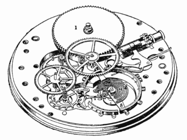
When we last looked in, the energy in our mechanical watch or clock had entered the device by means of a purposeful winding or by taking advantage of the potential energy in a raised weight as it descended to the earth. The energy was then stored in a tightly wound mainspring (in the case of the watch), wound around an arbor and connected to a barrel, which was both free to spin and capped with gear teeth. The barrel, which comprises all of those elements - the mainspring, arbor, and the gear-capped cylinder - interlocks with the all-important going train, which is the subject of this week's adventures in horology.

The Cast of Characters:

- The Mainspring Barrel  - a strong, steady type, as we saw in last week's episode. Strives to keep things moving smoothly, but can be a bit pushy.

File:Dscf3997 FederhausKleinuhr.jpg
The mainspring barrel, with and without the mainspring. Photo from Wikimedia Commons, but lacking a source. If this is your photo, please contact me and I will credit you!
- The Center Wheel - a newcomer to the story. In lockstep with the Mainspring Barrel, it keeps a very regular schedule. The Center Wheel has the honor of holding the Minute Hand, which gets paraded around once an hour like clockwork. Also charged with driving the Third Wheel.


- The Third Wheel - an awkward but necessary character. Is only included in the train to make the math work, and he knows it. Takes his duty of driving the Fourth Wheel very seriously, however.


-  The Fourth Wheel  - The Fourth Wheel has the dubious distinction of carrying the second hand - dubious because of the diminishing number of clocks that choose to flaunt a second hand. Worries that he will soon be obsolete. Also troubling: his second function of driving the escape wheel could easily be taken over by the Third Wheel, who has upward aspirations.

He's very shy.

- The Escape Wheel  - a spiky fellow, but absolutely necessary member of the Train. Has an impeccable sense of time and knows just when to give the Balance Wheel a push to keep it in the game. Very tight with the Escapement - they have a whole system worked out to make sure things happen on time.
Courtesy of mfrasca at en.wikipedia.
- The Pinions  - Small but mighty gears, without them the math simply would not work out. They feel strong attachments to their respective main gears and ensure that communication between all the biggest players comes off without a hitch.

In a watch, the pinion is on the outside. But you get the idea - it's a smaller gear rotating with the main gear to dial up or dial down the speed of rotation.


The Plot:

The reckless and headstrong Mainspring is hell-bent on pouring all of its power into the timepiece at once. There is much consternation and frenzy - too much energy in the watch at once will destroy the lovely Hairspring and rip apart her equally entrancing sister, the Balance - and without the Balance, there can be no Time! When it appears that no solution is forthcoming, at the last minute the valiant Gear Train leaps into action.

The Action:


The spring is wound and the stage is set. The mainspring pushes inexorably on the Mainspring Barrel, which grabs hold of the Center Wheel's pinion and forces it into lockstep. The dutiful pinion transmits the force of the Mainspring Barrel to the Center Wheel.

Due to the loyal pinion, the Center Wheel does not turn with nearly the force of the Mainspring Barrel, and lets the world know of its success by spinning the minute hand around the clock face at the rate of exactly one time per hour. The Center Wheel captures the attention of the Third Wheel's pinion, which spins the Third Wheel and distributes the Mainspring Barrel's energy even further. Already things are looking up for our heroines, the Hairspring and the Balance.

The Third Wheel spins the Fourth Wheel's pinion, raising the rate of rotation in its excitement. The Fourth wheel spins frenetically around at one turn per minute. In the midst of this frantic rotation, the Fourth Wheel finds the time to drive the escape wheel - the last gear to stand between the Mainspring Barrel and the Balance.

The Escape Wheel looks odd - its teeth are spiky, and it's made of different stuff than a proper watch gear. But the Escape Wheel is a steady fellow. He knows that without him, the rest of the watch gears would rotate with abandon, expending the Mainspring Barrel's energy with no regard for Time at all. The Escape Wheel is a regulator - he rotates precisely one tooth at a time in an arrangement he's worked out with his friend the Anchor. The Anchor is precisely that - it keeps even the Escape Wheel in check. Once the Escape Wheel has been brought down to a steady tick-tock rhythm, it sends just a bit of its energy down do the Balance - just enough to keep her spinning, rather than destroying her and the Hairspring in the process.


The Denouement: 
Thanks to these brave gears, the force of the Mainspring Barrel has been dialed down to a manageable force, and is even useful in keeping the Balance - she who actually keeps the time - running. Along the way, we passed over the contributions of the Motion Work and the underlying input from Gear Ratios.

All topics for the future.


Until next time!

Tuesday, January 24, 2012

Time and a Half


 I've never been one for small aspirations. As a kid, if they told me to build a model building out of paper, I was
 going to use the longest, thinnest paper available and hold the thing together by sheer force of will. After college, I
 wanted to work in science museum, so I picked the best one I knew of, got an (unpaid) internship, and flew
 across the country to start working two months later. When I decided to learn to snowboard, I took the ski lift to
 the top of the bunny slope, strapped in, eavesdropped on a kids' lesson to learn how to stand up, and went off to
 go snowboarding.

 I mention this because I know my own tendencies, and I suspect that my next project is beyond the scope of
 anything else I've tackled so far. I want to make a wooden clock.

 I chose a gear for my first SketchUp tutorial for a reason. I have a major soft spot for anything clockwork
 (from *before* it was popular, thankyouverymuch) and a serious penchant for little
 fiddly projects. I think precision makes things beautiful, and if you've ever seen the inside of a mechanical
 watch, you'll know that it's been precision-ed to death. So, a clock it is. Wooden because metalwork is a little
 beyond me right now and besides, look at this thing. It's gorgeous. This particular one is done by an immensely talented woodworker named Wayne Sutter.
This is gorgeous, and it's not even finished in this shot. Go buy a clock from him - we need more craftspeople like this.

 Clocks, especially mechanical ones, are amazing and complex works of careful engineering. Sounds like a
 great amateur project, doesn't it?

Image from Wikimedia Commons. Yay public domain!


 Clocks from the inside out
 Initial impression: Holy crap, there's a lot of vocab here. Right off, we have: mainspring, arbor, going
 barrel, ratchet, pawl, pinion, wheel train, escapement, remontoire, and balance wheel, just to name a few.

From a mechanical perspective, I think that the easiest way to tackle a watch movement (the whole thing in the back of a clock or watch that makes the thing go) is to trace the energy. Energy goes into the watch when you wind it, and out of it as the stored energy is expended in making the hands turn and the escapement oscillate (and the alarm go, and the cuckoo bird cuckoo, etc.). When you wind a watch, you spin a post, or turn a key that turns a post, called an arbor. The arbor connects to a spiraling strip of metal called the mainspring.
The mainspring.
Image from Wikimedia Commons.

 The mainspring is attached to the arbor from the inside of the spiral, making the whole thing look a little like a spinning top, or maybe a barred galaxy if you're creative. 

The arbor/spindle/massive beams of radiation would be coming out of the center of that.


The other end end of the mainspring attaches to a short, fat cylinder called the going barrel.

Also Wikimedia.
The barrel is free to spin, which is a good thing, because the barrel cylinder is capped with what is essentially a solid gear. This gear is used to interact with the gear train, which is the bit that makes the hands and other useful parts move. Its most important function, though is to power the balance, the little wheel that does for a wristwatch what a pendulum does for a grandfather clock.  

A real-life example: the going barrel in this watch is capped by the gear you can see in this picture. It also happens to be upside down.

Suppose you got bored at this point and thought, what the hell, we've got a power source and something that spins - let's just put some hands on it and let 'er rip! You'd have a timekeeping device of some sort, but right now there's nothing to counteract the force of that spring - you'd wind it, let it go, and it would release all its energy all at once. You'd measure time in spring-unwindings instead of seconds. 

That's where rest of the gear train comes in. That'll have to wait for part two, though. In the meantime, here's some watch porn for all you horologists out there. 

...that even sounds dirty.


Saturday, January 21, 2012

Google SketchUp 8 Tutorial - Drawing a Gear

I set out at around 5 PM today to draw a gear in Google SketchUp 8. How hard could it be? I said. It's only a couple of circles, I said. Five and a half hours later, I finally have this to show for myself:
Are you proud? I'm proud.


I spent an awfully long time looking for the tools I needed to make this, so I thought I'd put a tutorial out there about how I finally managed it. I'm going to assume that you have a basic working knowledge of SketchUp - what the premise is, how to use the more basic of the tools, etc. - but no more. So, in approximately 18 easy steps, here we go!

Step 0. One of the things I've really gotten used to in other graphics programs (namely, Illustrator and Photoshop) is the ease of using keyboard shortcuts. I'm so used to them that it's irritating that my favorites (Ctrl to switch to the last tool you used, anybody?) aren't here in SketchUp, but there are a fair number of easy-to-remember shortcuts that I used in drawing this. I'll list them where I think they're useful. I'd highly recommend getting used to using them, especially if you're using a touchpad instead of a mouse.

Step 1. Open Google SketchUp (I have version 8), and use the circle tool (keyboard shortcut "C") to draw a circle on the x-y plane. Here, I'm using red as x and green as y.

I made my gear with exact dimensions, so that's how I'll write the directions, but there's no need to be so precise. You can make most of the dimensions to be whatever you want. That said, there's an easy way to make your shapes with exact measurements. Here, I made a circle with a 2 cm radius. Using the circle tool, click anywhere, move the mouse a little distance away (don't click!), type "2cm", and press enter. You should have this:
Little floating circle. You're viewing it at an angle, so it doesn't look perfectly round.

Step 2. Using the line tool (L), draw a 15 cm line from the center of the circle out parallel to the x (red) axis This will be a guide line, so don't worry if it doesn't look like a gear. 

A couple of useful pointers here. To find the center of the circle quickly, once you've picked up the line tool, hover over the edge of your circle for 2 seconds, then move your cursor slowly toward the circle's center. A light blue dot labeled "center" should pop up. Your mouse should snap right to it. 

Although the line doesn't need to be drawn in any particular direction, I like orienting to the axes if only so I'm positive I haven't suddenly drawn a line in the z direction (out of the plane). When you're moving in the x direction, the line trailing from the line tool will turn red, and a popup box next to your mouse will tell you what direction you're going. You should have this after you've drawn your line: 


Step 3. Before I did the next step, I orbited (O) so that I had a top-down view of my figure. That makes it a little easier to draw the next bit. Using the line tool (L again), you're going to draw three sides of a square at the end of your guideline. Click on the endpoint of the guide, draw a 1 cm line in the same direction, turn right to draw a 1 cm line in the green direction, and right again to draw one last 1 cm line in the red direction. This will be your first gear tooth. 
Ignore the blue line. I just spun the view around a bit. 

Step 4. Use the eraser tool (E) to erase the very first line you drew.
First tooth! It's so cute.

Step 5. Select the gear tooth by pressing the spacebar and click-dragging over all three lines. (Side note: there is a difference between dragging right-to-left and left-to-right. The Google SketchUp video tutorials explain this very well, so I won't.)


Step 6. This step can be finicky, but I'll try and break it down as best I can. First, choose the rotate tool. Find the center of the circle again and click once. Move your mouse along the red axis and click again - it really doesn't matter how far along you go. Now, before you do anything else, press Ctrl (Option on a Mac) once. A small plus sign should appear next to your cursor. This means that SketchUp is not only going to rotate our tooth, it's going to be duplicated as well. 

Step 6a. Move your mouse clockwise a small distance. Type "360" and press Enter. 

Creating the first duplicate. You can do this by hand - just move the duplicate tooth in a full circle so that it overlaps the original, then click. I had trouble with this, though - as soon as I overlapped the first tooth, the counter at the bottom right would click back over from 359.9 to 0.0, and that would mean that you're not rotating through any degrees. Easier to just type in 360.

Step 7.  Before you do anything else, type "/50" and press Enter again. What you just did was tell SketchUp to rotate the tooth through 360 degrees, then duplicate it evenly 50 times through the whole circle.


Starting to look gear-like!

Now, 50 was a semi-arbitrary number that I chose. It just happened to make a regular-looking gear. If I were modeling this for physical production, I'd be much more careful in how I sized the teeth. At this point, any number that makes the gaps nearly the same size as the teeth will do. 


Step 8. This is the tedious bit. Take the line tool again and connect the bases of all the teeth together. 

Connect the teeth bases endpoint-to-endpoint. Takes a while, but it's gotta be done.
Step 9. When you connect the last one, the shape you made should turn gray, meaning that it's no longer a line - it's a face!
Ok, that wasn't really a step. I just added it in because I mis-numbered my screenshots and I needed an extra one to make them line up with my notes.


Step 10.  Now we have to set some guidelines so that we can form the spokes of our gear. This is another slightly finicky process, so be methodical and take it step by step. 

Choose the protractor tool (Tools menu > Protractor) and click in the center of the small circle. Now, move your mouse along the red axis (again, any direction in the same plane is fine, but the red axis is convenient). Click anywhere on the line you chose. Move your mouse clockwise slightly. Type "72" and press enter. A dotted guideline should appear 72 degrees clockwise from the red axis. 

Now, do the same thing again, except this time, instead of moving your mouse along the red axis, move and click along the guideline you just made. You should have two guidelines now. 

Repeat those steps three more times, each time clicking first in the center of the circle, then along the newest guideline before moving the mouse clockwise and typing in "72". 

You should have something like this:
Gear pizza.

I did one more thing to make my life easier later on. We're only going to be using half of those guidelines, so I used the rectangle tool to mark every other one.

Step 11. Use the push-pull tool to pull your gear up 1 cm vertically.


Step 12. Before you start this step, orbit (O) to the bottom of the figure. This will make your guidelines easier to work with.  Using the offset tool (F), offset the center circle first by 12 cm, then by 3 cm. 


 Step 13. Choose the line tool. Using the marked guidelines, connect the two circles you just drew. Make sure that when you draw them, the "intersect" symbol pops up as a red cross when you hover over the points where the guidelines and the circles meet. I thought I had a picture of this step, but I don't.

To make your figure look like the next picture, use the eraser tool to remove the guides. Then, using the offset tool on each of the slices you just made, offset them inwards by 0.5 cm.
Sorry, that's a lot of steps with very few pictures. To clarify: this picture shows five "spokes" alternating with five curved pieces. The thin spokes are the lines that you draw to connect the outer and middle circles. The curved pieces are what you get when you offset the shapes from the first step by 0.5 cm inwards. 


Step 14. Use the eraser to remove the thin spokes, leaving only the curved slices behind. 


Step 15. Use the push-pull tool to push the fat arcs through the gear to make windows. I found that I had the best luck with this when I entered "1cm" manually after clicking on each shape with the push-pull tool. Otherwise I had a tendency to just push them all the way through to the other side.


Step 16. Orbit to the other side again. Using the offset tool, offset the rim of the inner circle 0.25 cm outwards. (This is another one I wish I had taken a screenshot of, but didn't. Essentially, what you want to do is widen the center hole so that you can easily erase the surface that's in the middle.)

You should have a very very thin sliver of a hollow cylinder surrounding the center circle. Push that sliver through the gear 1cm, so that you have a thin window. Now, select the gray face that's left over and delete it.

Note: If you turn the gear back over, you'll note that it looks hollow. This is easily fixable by using the scale tool to shrink the middle edge of the gear in to meet the center hole. Press Ctrl (Option on a Mac) to highlight the center of the circle, then pull one of the corner handles in until the edge of the gear and the edge of the hole overlap. 


Step 17. Now, all that's left to do is color it! I modified the stock corrugated metal skin to look more like brass, but you can do whatever you want with it. 


And there you have it! I know there's some stuff here that is a little roundabout and could probably use some tweaking. Do you have an easier way to make a gear? Let me know in the comments!